In all of design history, can you think of a worse error than the fact that a lowercase “L” and an uppercase “I” often look the same?
{ Just a thought. }
Dive Deeper
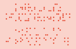 Now Available: Triptych One Cryptographic TypefaceJune 14, 2023Now available — the second Hanttula Cryptoglyph: "Triptych One." […]
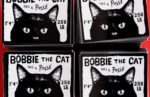 Bobbie the Cat has a posseAugust 23, 2022A sticker campaign to bring more notoriety to a neighborhood cat. […]
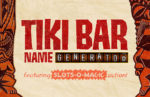 Tiki Bar Name Generator UpdatedJune 6, 2022New tiki terms added to now offer over 120,000 possible name combinations! […]
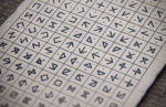 Announcing: the Hanttula CryptoglyphsMay 31, 2022Newly released: the first set of Hanttula Cryptoglyph symbols & fonts — for all your secret messaging needs. […]
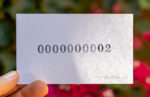 In Development: SIGNED & NUMBERED Art SeriesJuly 30, 2021Work in progress: the SIGNED & NUMBERED art series. What number will YOU get? […]
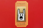 In Development: ADMIT ONE Art SeriesJuly 30, 2021Work in progress: the ADMIT ONE series of hand-drawn, small, and devastatingly adorable artworks. […]
Recent Comments